
Proftit is a Fintech company who offers CRM solutions for brokers. As the company launched a new Prop Trading service for the brokers to offer their clients, we needed to make adjustments to the existing client page, a high-frequency tool used daily by sales and support teams. The original page was outdated, cluttered, and had been gradually patched over time without a cohesive structure. With the addition of the prop trading feature, which brought in a significant amount of new data and flows, the existing interface became unusable. At the same time, we were working on creating a new design system and this redesign was an opportunity to use it for the first time. The goal was to transform a cluttered, outdated interface into an intuitive and action oriented workspace.
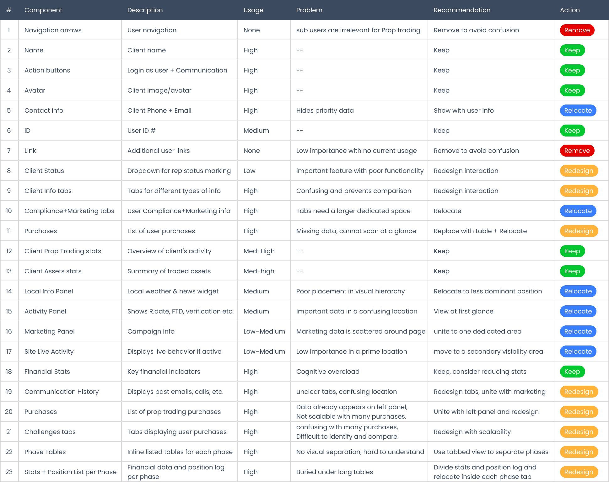
I began by reviewing and analyzing the existing Client Page in detail. First, I mapped out usability issues, inefficiencies, and areas of confusion. I then conducted interviews with our technical support team, CS reps, and a pilot customer (a broker testing the new prop trading feature with their clients). Additionally, I requested raw usage data directly from our developers. This included metrics such as the number of times each tab was opened, frequency of use for key action buttons, and which panels or modals were rarely accessed. This quantitative data validated the findings from interviews and helped prioritize which areas to highlight, simplify, or remove entirely.
These conversations revealed that most users only knew how to use a fraction of the system. They relied on the bare minimum, as the structure was confusing, and many features were buried or unclear.
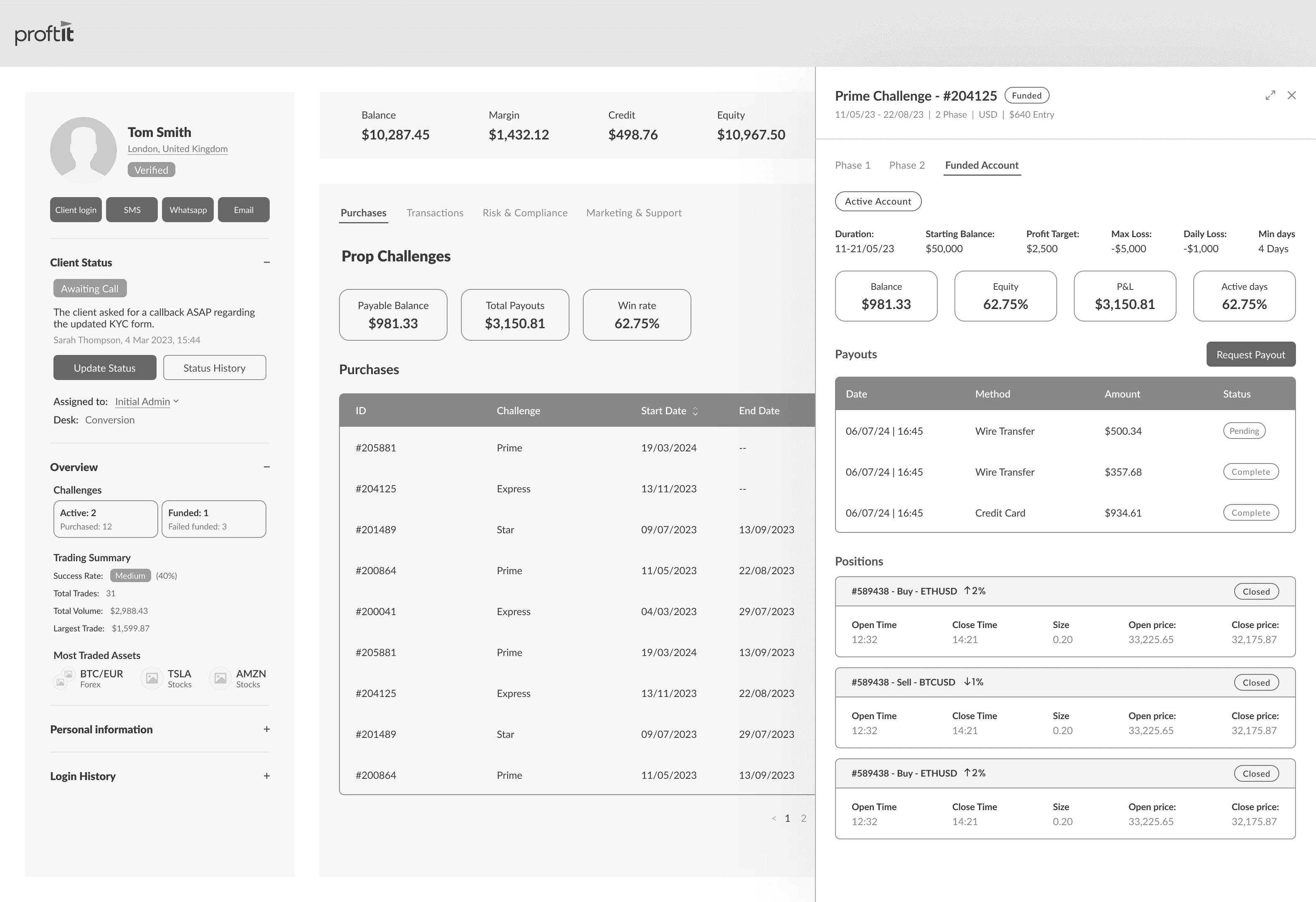
One example was the "Local Info" widget, which took up valuable space and showed weather/news in the client’s location to encourage small talk. While a small number of reps valued the feature, the majority were unaware of its purpose.
Other problems included the user information tab navigation. The tabs were icons without text so users didn’t know what each tab contained, and switching between them during calls was confusing. Since only one tab could be open at a time, users couldn’t view two data sets side by side, which added friction.
Another insight: Prop trading accounts contain much data than standard trading accounts. Each challenge has multiple phases, and each phase includes more complex metrics. This created a chaotic cluster of tables on the page.
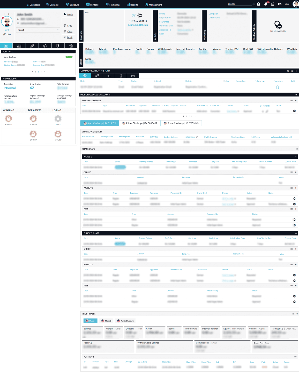
Current Client page
01
02
03
01
Re-evaluate underused features:
Assess underused features to determine whether they should be improved to increase usability or removed to reduce cognitive load, ensuring every element on the page has clear value.
02
Improve clarity and hierarchy: Create a visual structure that helps users immediately understand where to look and what matters most.
03
Increase discoverability:
Make features and information easier to find, especially when working under the pressure of live client interactions.
After completing the usability mapping and setting clear design goals, I moved into the wireframing phase. I created low-fidelity wireframes to visualize the restructured layout, new interaction model, and prioritized content hierarchy.
The redesign focused on:
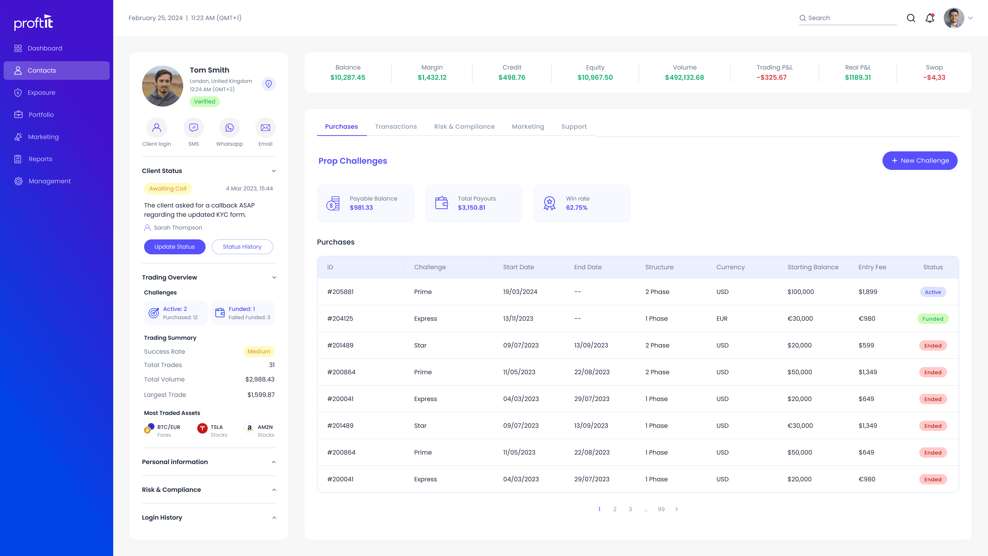
• Surfacing client status and trading summary information at a glance.
• Grouping prop challenges into a clear, scannable overview.
• Breaking down individual challenges into a dedicated, focused view with structured tabs.
• Reducing clutter by consolidating related actions and displaying only relevant information.
Before moving to high-fidelity mockups, I conducted internal user testing with CS and sales reps using the wireframes. These teams not only support brokers and understand their day-to-day needs deeply, but also serve as users of the CRM system themselves—using it to manage our own client base.
The goal was to validate:
• Whether the new structure supports quicker understanding of the client's trading behavior.
• If users can find and access key features during live calls with less friction.
• Which areas still felt overloaded or unclear.
The testing surfaced actionable insights:
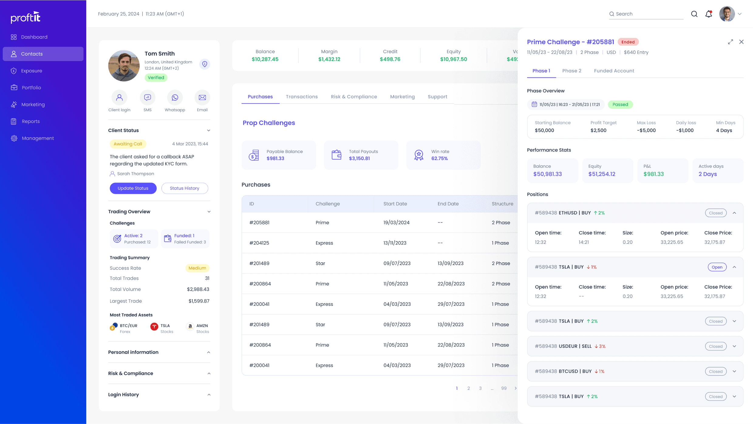
• Marketing & Communication Tabs
Originally combined into a single tab to reduce visual clutter, users found it unintuitive. Based on this feedback, we decided to split them into two distinct tabs to better reflect actual usage patterns.
• Local Info Widget
Initially relocated due to low usage rates, testing revealed that for the 40% of users who relied on it, the new hidden placement disrupted their workflow. As a result, we redesigned this widget to display a concise preview (location and local time) by default, with weather and news available on click to maintain accessibility without overwhelming the UI.
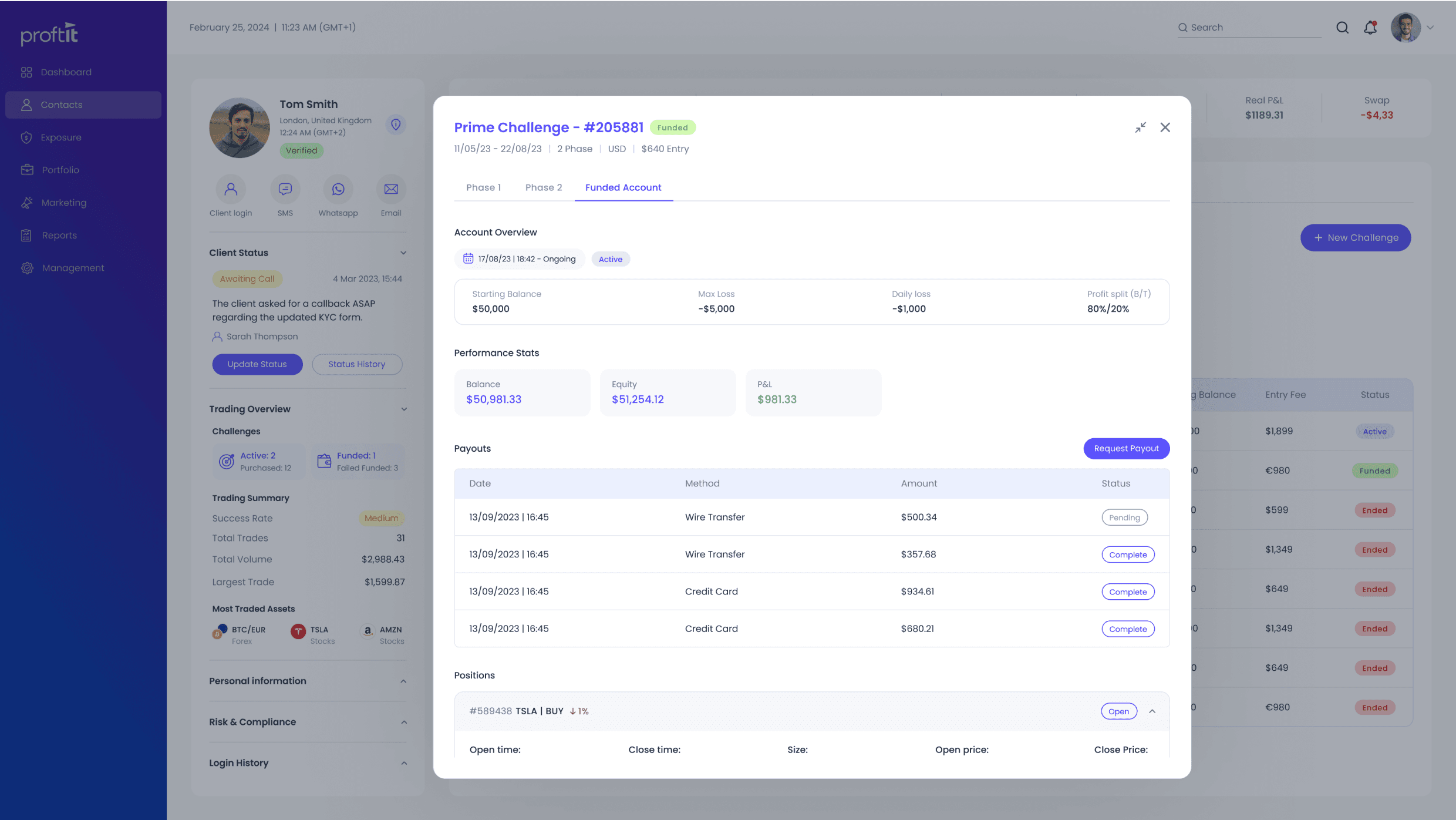
• Risk & Compliance Section
Originally moved entirely into a tabbed section, testing revealed that during live calls, reps frequently try to assess a client’s risk and compliance status as part of their initial scan while speaking with the client. This highlighted the need for a glance overview. In response, a complience overview was added on the left panel, summarizing key risk and compliance indicators.
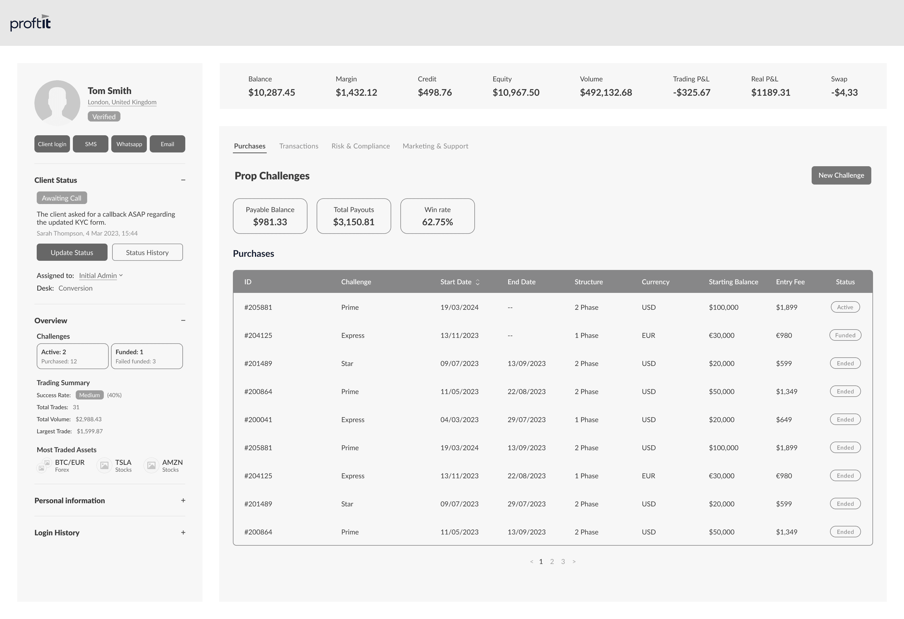
Client page
Challenge Side panel
Expanded Challenge Modal
The redesigned Client Page resulted in measurable improvements:
• Time-to-action for key workflows dropped by 40% in internal testing.
• 60% of support reps reported feeling more confident navigating client data during live calls.
• Dev usage data showed a clear decrease in context switching, with fewer tab switches and redundant clicks.
• Proftit’s Sales teams began showcasing the redesigned page during demos and reported a noticeable increase in conversion rates.
Beyond the direct product impact, this project sharpened my ability to:
Balance user needs with technical and organizational constraints
Prioritize clarity over complexity when introducing new functionality
Leverage internal user feedback loops for iterative improvement
Make strategic trade-offs as not all issues were tackled at once. Some tabs were intentionally left unchanged due to scope limits. This wasn’t just a constraint, it was a conscious decision to avoid overwhelming users with a full end-to-end redesign. Keeping familiar elements in place helped ease the migration and improve adoption of the new layout.