

Trading App - Trading Flow Design
Trading App -
Trading Flow Design
Trading App -
Trading Flow Design
Trading App -
Trading Flow Design
UX/UI Design • Mobile App

Overview
Overview
While working as a designer in Proftit, the company had an existing Web-trader platform, and was in the process of launching a native mobile version to offer users a seamless cross-device experience.
The position opening flow is central to any trading platform, It allows users to open various positions with configurable parameters such as trade size, leverage, stop-loss, and take-profit levels.
As Webtraders are designed for desktop screens, all trading parameters are typically displayed on a single screen. When translating this functionality into a mobile experience, it was necessary to break the process into an intuitive flow while maintaining the full range of functionality. The goal was to design a mobile flow that supports a smooth trading experience, without compromising the power and flexibility that experienced Webtrader users rely on.
Company
Company
Proftit
Proftit
Year
Year
2024
2024
Role
Role
Product Designer
Product Designer
Understanding the User: Research Foundations
Understanding the User: Research Foundations
Since the mobile app was built from scratch, I began the process by speaking with the Customer Support and Customer Success teams to gain insights into how users interacted with the WebTrader and what their main challenges were.
Since the mobile app was built from scratch, I began the process by speaking with the Customer Support and Customer Success teams to gain insights into how users interacted with the WebTrader and what their main challenges were.
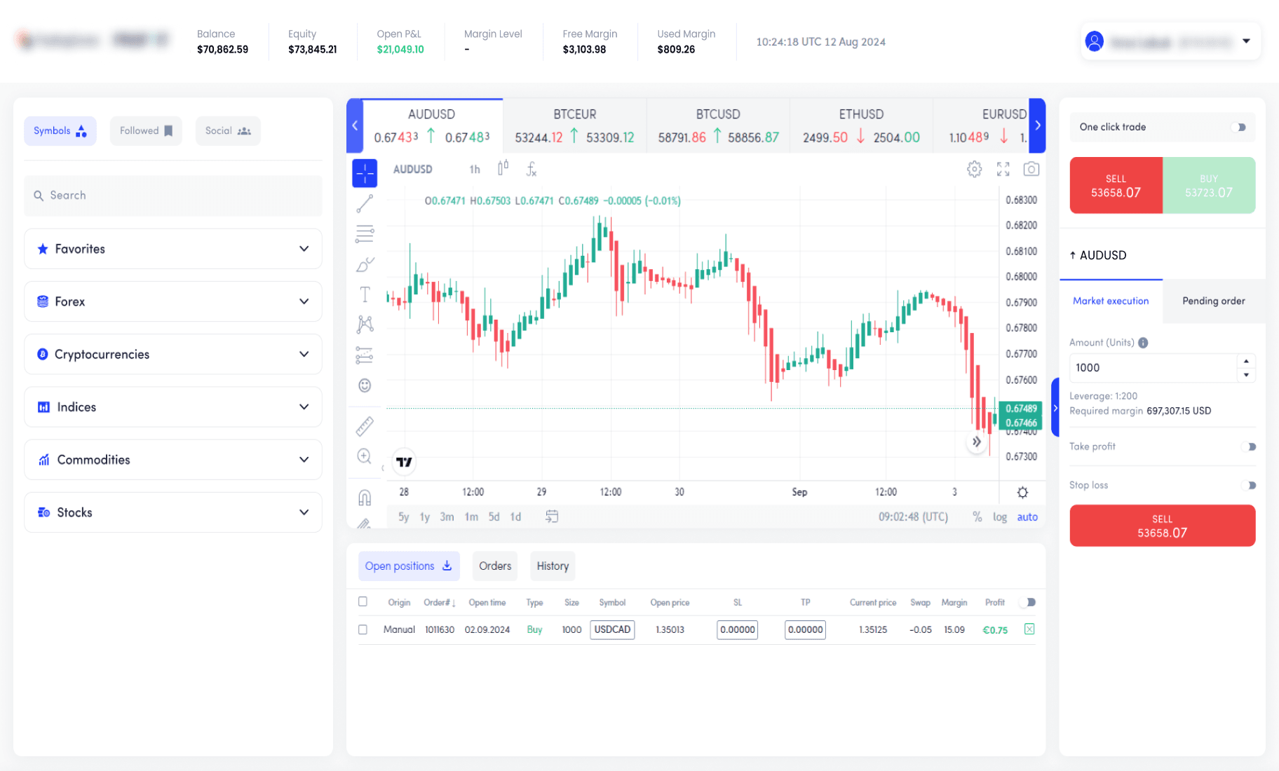
Current Web-Trader
Current Web-Trader
Key insights from Customer Support & Customer Success reports:
Key insights from Customer Support & Customer Success reports:
01
Users often lack clear direction when starting a trading session. Many don’t know which symbols are moving, trending, or worth looking at today.
Users often lack clear direction when starting a trading session. Many don’t know which symbols are moving, trending, or worth looking at today.
02
The Web-trader presents all trade parameters (size, leverage, Stop Loss, Take Profit, etc.) in a single view, which creates cognitive overload and leads to errors.
The Web-trader presents all trade parameters (size, leverage, Stop Loss, Take Profit, etc.) in a single view, which creates cognitive overload and leads to errors.
03
The asset search functionality is hard to use and made it difficult for users to find the symbols they were looking for.
The asset search functionality is hard to use and made it difficult for users to find the symbols they were looking for.
In addition to internal research, I conducted a competitive analysis of leading trading apps to understand how other platforms approach asset discovery and trade execution.
In addition to internal research, I conducted a competitive analysis of leading trading apps to understand how other platforms approach asset discovery and trade execution.
Key insights from competitor research:
Key insights from competitor research:
Some apps leaned toward over-simplification, which came at the cost of functionality
Mobile interfaces often lacked feedback during the trade setup process
Some apps leaned toward over-simplification, which came at the cost of functionality
Mobile interfaces often lacked feedback during the trade setup process
Design Goals
Design Goals
Based on user insights, internal feedback, and competitive analysis, I defined the following design goals for the mobile trading experience:
Based on user insights, internal feedback, and competitive analysis, I defined the following design goals for the mobile trading experience:
01
Provide powerful tools in a clean, intuitive interface that feels professional yet accessible for experienced non-pro traders.
Provide powerful tools in a clean, intuitive interface that feels professional yet accessible for experienced non-pro traders.
02
Respect the user's level of expertise and avoid over-simplification.
Respect the user's level of expertise and avoid over-simplification.
03
Design an asset discovery experience.
Design an asset discovery experience.
04
Replace the basic search with a search system that supports exploration and decision making
Replace the basic search with a search system that supports exploration and decision making
05
Create a trade setup that allows users to configure trades with clarity and confidence.
Create a trade setup that allows users to configure trades with clarity and confidence.
Flow definition
Flow definition
After gathering insights from user research and defining the design goals, I worked with the Product Manager to define a user flow that meets both product and UX goals. Together we merged our insights into a flow that reflects both product strategy and user experience requirements and supports a smooth, focused user journey from discovery to execution.
After gathering insights from user research and defining the design goals, I worked with the Product Manager to define a user flow that meets both product and UX goals. Together we merged our insights into a flow that reflects both product strategy and user experience requirements and supports a smooth, focused user journey from discovery to execution.

Wireframing
Wireframing
Once the flow was mapped out, the Product Manager provided a detailed spec file outlining the required components and functionality of each screen. I then created wireframes to bring those requirements to life and validate the core experience.
Once the flow was mapped out, the Product Manager provided a detailed spec file outlining the required components and functionality of each screen. I then created wireframes to bring those requirements to life and validate the core experience.
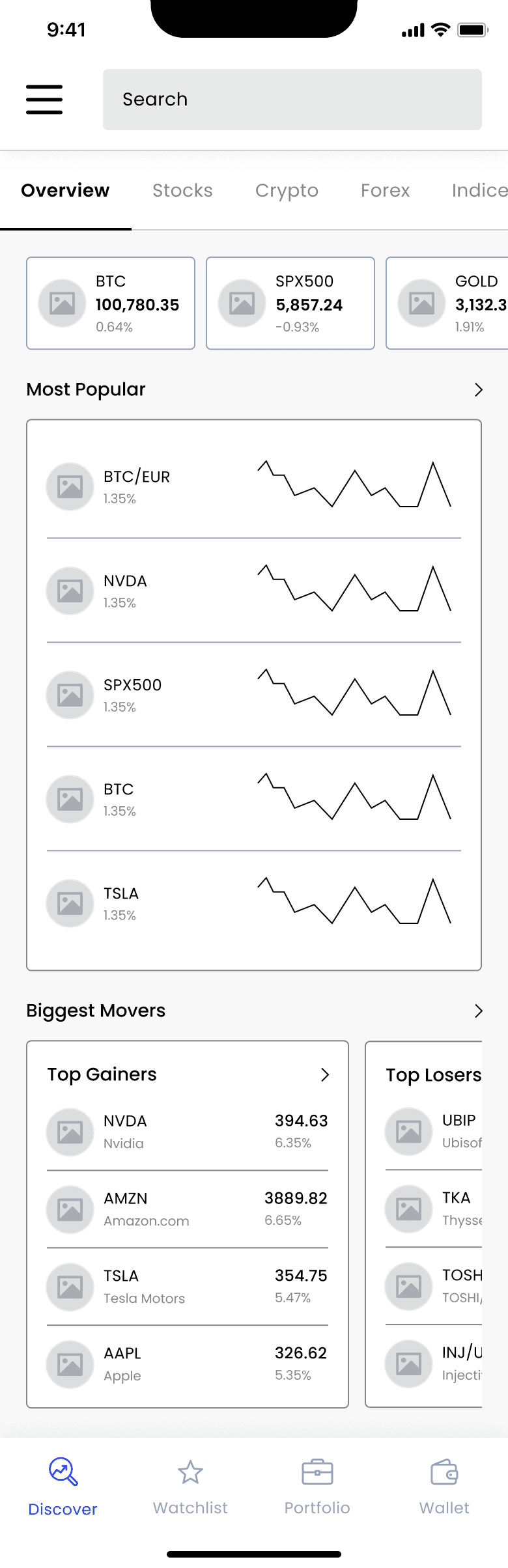
Discovery Page
Discovery Page
The Discovery page was designed to help users quickly scan the market and identify trading opportunities without needing to leave the app or rely on external tools. I focused on creating a visual hierarchy that surfaces the most relevant data.
During the flow validation stage, I learned that users often wanted to return to symbols they had previously viewed. Based on that insight, I added a "Recently Viewed" section, giving users a fast way to pick up where they left off.
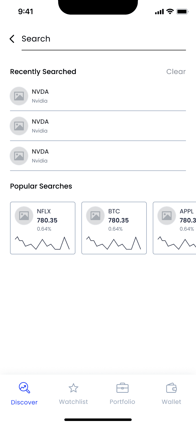
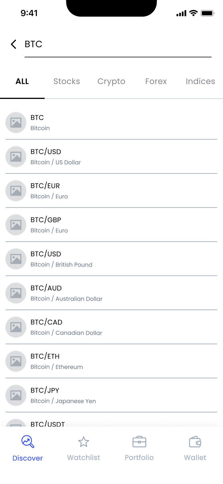
Search
Search
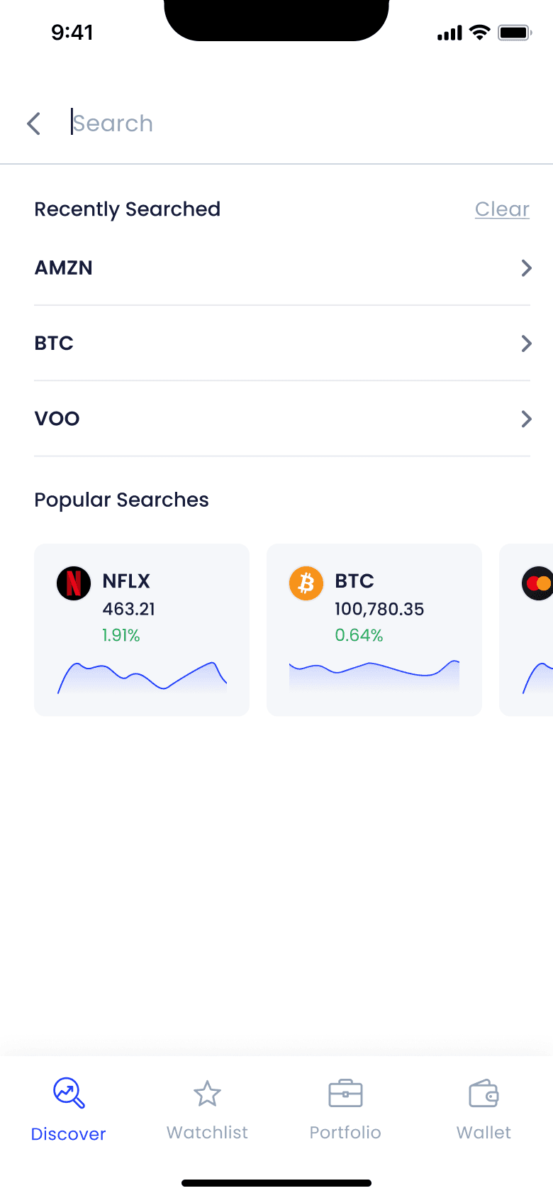
The search experience was designed to support users who know exactly what they’re looking for as well as users who need a bit of inspiration or direction.
In the Search screen, I combined “Recently Searched” and “Popular Searches” to give users a sense of both personal history and market trends. Assets are grouped under clear categories (like Crypto, Stocks, Forex etc.) to help users narrow results down quickly.
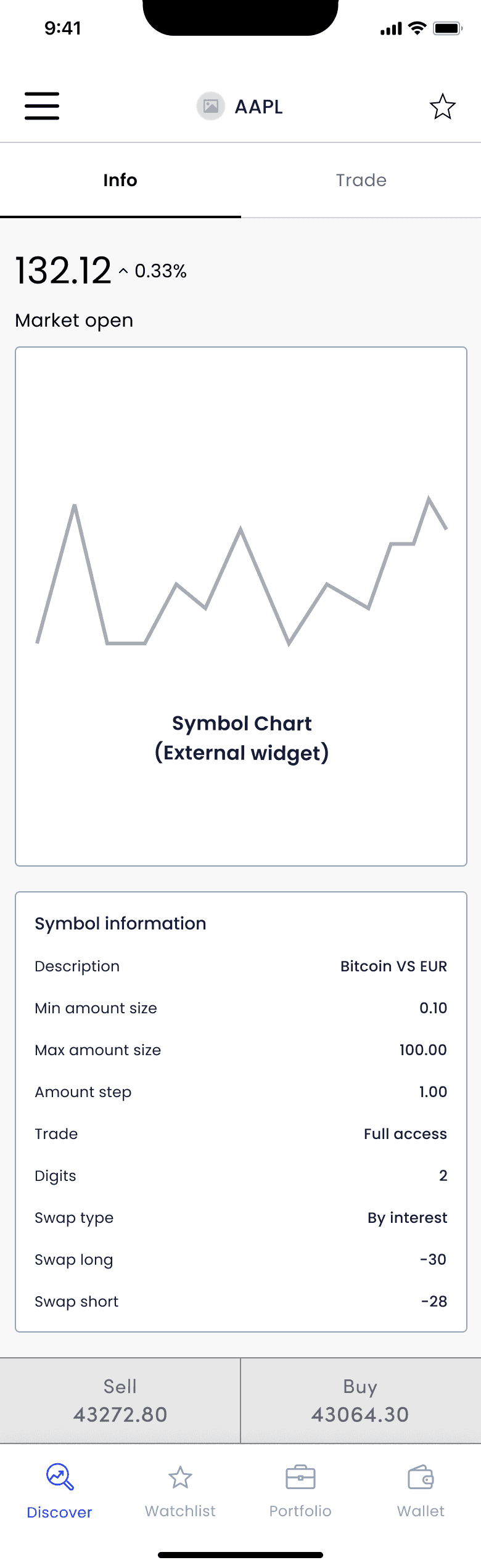
Symbol Page - Info
Symbol Page - Info
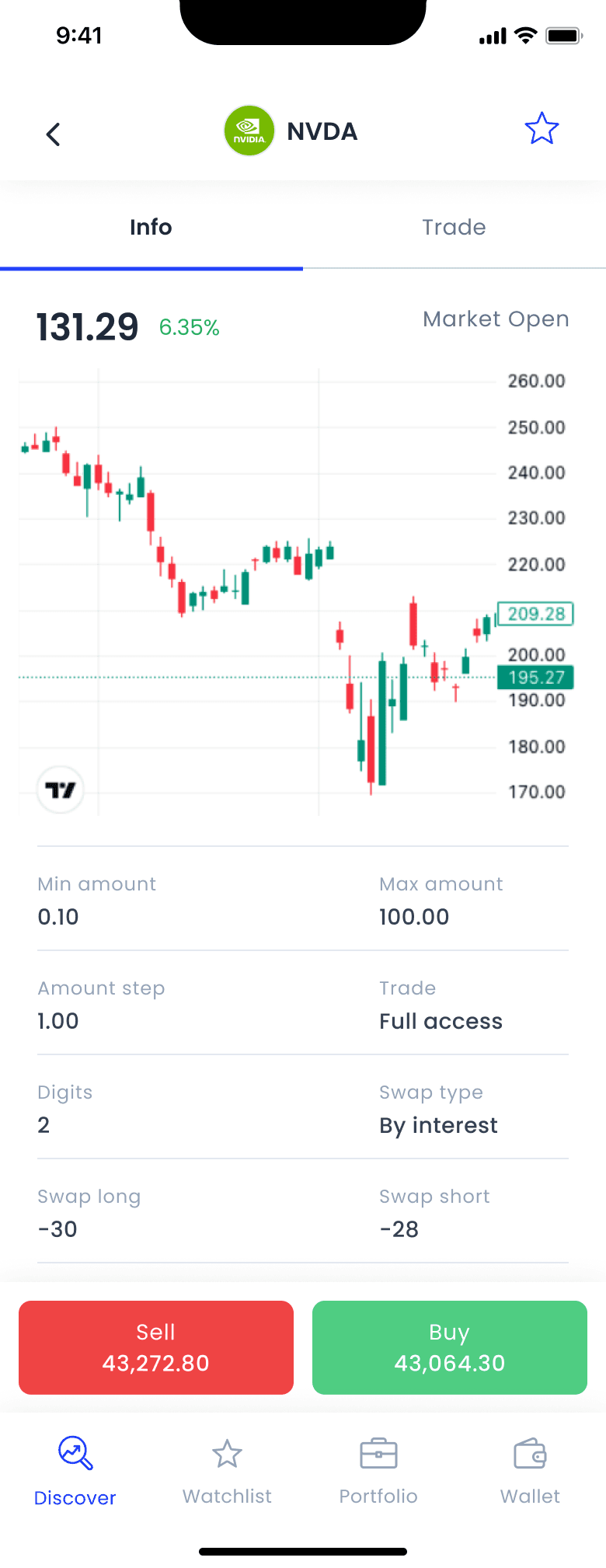
The Symbol Info page gives users a clear, real-time overview of an asset’s performance and trading conditions. All parameters update live, giving users the confidence that they’re always viewing the most up-to-date market data. The chart features an embedded TradingView widget which I integrating smoothly into the visual hierarchy. Below the chart, I organized all trade-related data points in a simple layout for easy scanning. This level of detail supports semi-experienced traders before opening a position.
To ensure users can take action at any moment, the Buy and Sell buttons are sticky at the bottom of the screen, remaining visible at all times while scrolling.
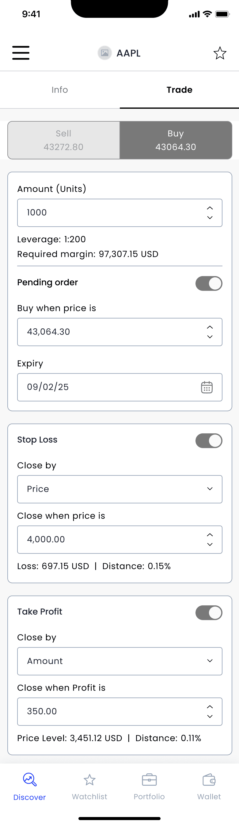
Symbol Page - Trade
Symbol Page - Trade
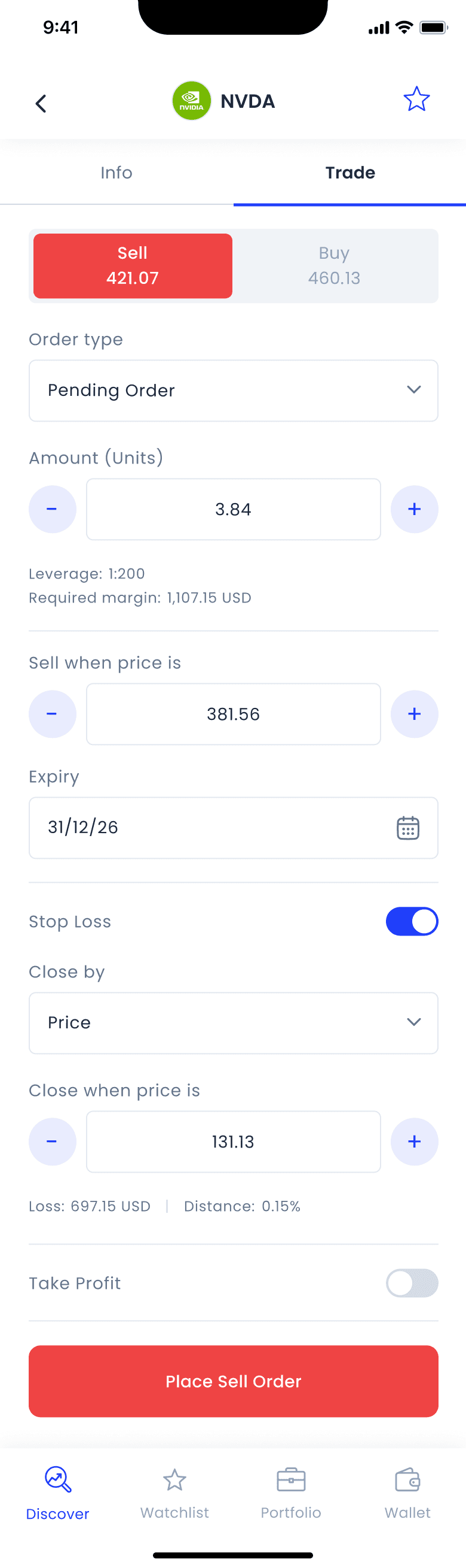
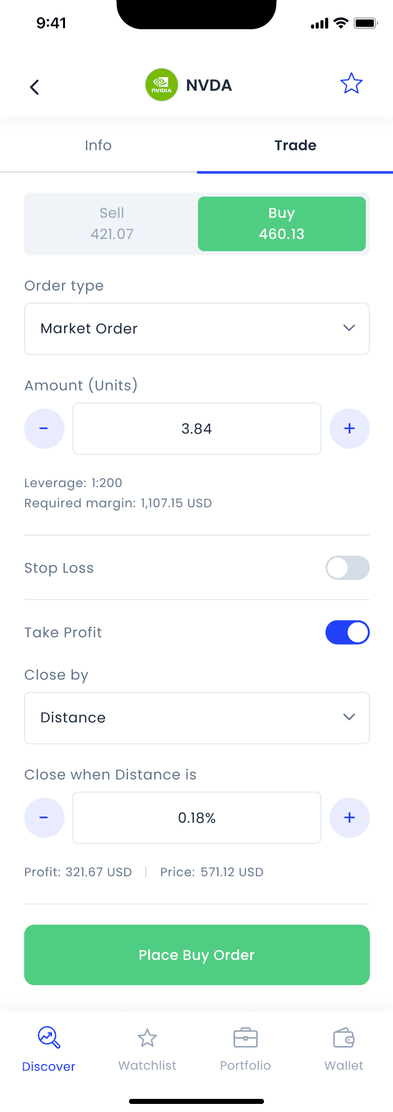
The trading page supports both simple and advanced order configurations. Users select the action (Buy/Sell) and define the amount they wish to trade. Margin and leverage details provide immediate feedback on risk and capital requirements. When “Pending Order” toggle is activated, additional fields appear to set the target price and expiry date. The Stop Loss and Take Profit sections are optional settings for users who want more control over risk and profit. While adjusting these settings, user receives real time feedback which gives clarity before committing.
The trading page supports both simple and advanced order configurations. Users select the action (Buy/Sell) and define the amount they wish to trade. Margin and leverage details provide immediate feedback on risk and capital requirements. When “Pending Order” toggle is activated, additional fields appear to set the target price and expiry date. The Stop Loss and Take Profit sections are optional settings for users who want more control over risk and profit. While adjusting these settings, user receives real time feedback which gives clarity before committing.
Flow Validation
Flow Validation
Before moving into visual design, I ran a flow validation to validate the overall structure and usability of the trading flow. I tested the wireframes with brokers from our pilot collaboration, along with a few people from our internal CS and support teams. These were my key findings:
Before moving into visual design, I ran a flow validation to validate the overall structure and usability of the trading flow. I tested the wireframes with brokers from our pilot collaboration, along with a few people from our internal CS and support teams. These were my key findings:
• Pending order setting created confusion
Some users didn’t immediately grasp the "Buy when price is" field or confused it with regular market execution.
• Pending order setting created confusion
Some users didn’t immediately grasp the "Buy when price is" field or confused it with regular market execution.
• Stop Loss / Take Profit toggles were overlooked
Many users didn’t understand that these sections were optional
• Stop Loss / Take Profit toggles were overlooked
Many users didn’t understand that these sections were optional
• Discovery screen lacked “Recently Viewed” context
Users expected to see a “Recently Viewed” section to quickly return to symbols they had explored.
• Discovery screen lacked “Recently Viewed” context
Users expected to see a “Recently Viewed” section to quickly return to symbols they had explored.
Based on these findings, I made several updates to the wireframes to address the issues users encountered.
Based on these findings, I made several updates to the wireframes to address the issues users encountered.
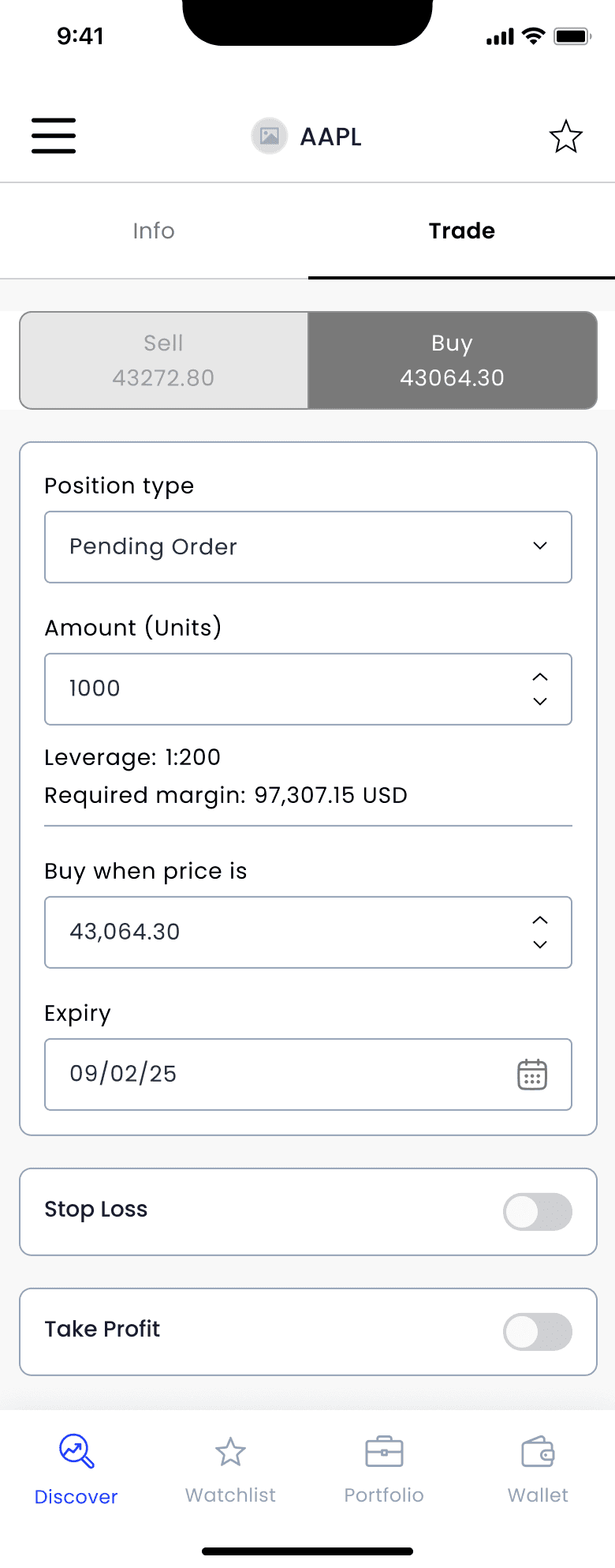
Trade Screen
Trade Screen
In the Trade screen, I restructured the layout to first ask the user to choose the order type (Market / Pending) and only then display the relevant fields, replacing the previous toggle interaction which caused confusion.
For Stop Loss and Take Profit, I kept the toggles but set them to a closed default state, clearly indicating that these are optional. This approach aligns with common practices in similar trading apps and helps reduce cognitive overload.
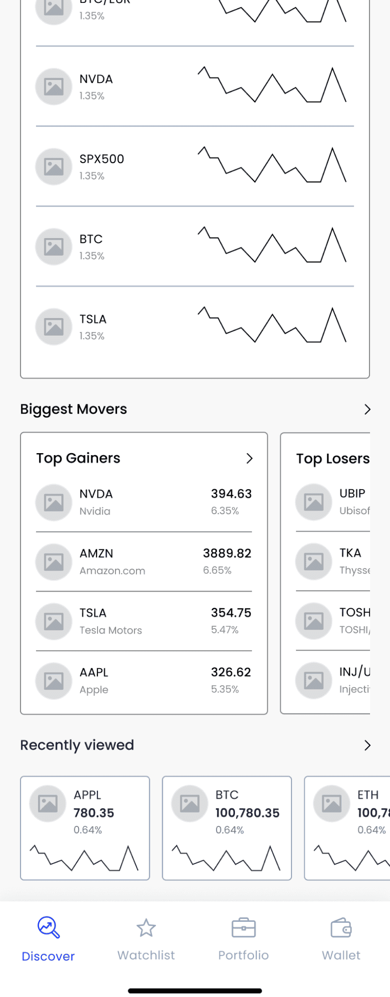
Discovery Screen
Discovery Screen
In the Discovery screen, I added a “Recently Viewed” section to help users quickly return to symbols they had previously explored.
In the Discovery screen, I added a “Recently Viewed” section to help users quickly return to symbols they had previously explored.
UI Process
UI Process
At this point, I moved on to UI design. Since this flow was part of the MVP, the design system was being built alongside the product, so I adjusted and added components as new needs came up.
At this point, I moved on to UI design. Since this flow was part of the MVP, the design system was being built alongside the product, so I adjusted and added components as new needs came up.
Discovery Page
Discovery Page

Search
Search
Search Results

Symbol Page - Info
Symbol Page - Trade (Sell)
Symbol Page - Trade (Sell)
Symbol Page - Trade (Buy)
Symbol Page - Trade (Buy)
Search Results
Search Results
Symbol Page - Info
Symbol Page - Info
Impact & Takeaways
Impact & Takeaways
Within the first 30 days of launch, Data showed:
• 20% of all trades were opened via mobile (before launch, 100% of trades were done on the Webtrader)
• 30% faster average flow completion time, based on usage logs
• 18% of previously demo-only users transitioned to real trading accounts
• Brokers noted a clearer, more focused flow
Translating a complex Webtrader flow to mobile wasn't about fitting everything onto a small screen, it was about restructuring the experience from end to end. Working closely with CS and brokers helped uncover real user pain points that couldn’t be spotted from product specs alone. Seeing those insights come to life in the new app experience was incredibly rewarding.